There's no question about it, Art Basel Miami is bigger, better, zanier, and more unique than any other art fair I've participated in. It's energizing but also a real energy suck no matter how successful you are. However, I'm pleased to report we had a very successful fair, exceeding expectations. So sorry about the delay in the report, but there has been a lot of follow-up to do. This is good news.
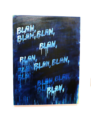
Regarding the picture above, I kid you not. This is a finished booth at Art Basel Miami, as are the next four below. Click into them for a more detailed look and tell me what you think. This is contemporary art.
Given the above, it wasn't a huge surprise that our booth had a steady stream of traffic that made it, according to most reports, the most crowded booth at the fair. When asked to define the gallery's aesthetic, I sometimes answer that it's about the nexus of quality, originality, and accessibility - which is not the hippest place to be - but in contrast to much of the minimalism, conceptualism, and what sometimes I can only see as cases of a real Emperor's new clothes syndrome of art, it pays off.
Anyway, this is the Danziger Projects booth below.
Nevertheless, I did steal away to look for good things for the blog. But with the vast array of works and galleries, it was paradoxically difficult to choose a top ten, but here goes. I've mixed media as the fair had less photography this year than in years before. I wonder whether this is an early sign of a trend of contemporary art galleries (as opposed to photography galleries) backing away from photographs.


